BONEBABY x GXTH
A split landing page built to route a client’s audience cleanly between two brand directions. The site keeps the decision simple: one screen, two identities, one immediate choice.
A split landing page built to route a client’s audience cleanly between two brand directions. The site keeps the decision simple: one screen, two identities, one immediate choice.
Instead of treating the project like a normal company website, the page works as a decision split. Each side represents a different destination, with the composition doing most of the communication before the user even reads the text.
The client did not need a bloated landing flow. They needed something visually direct, brand-led, and easy to understand on first load. The split layout reduced friction and made the choice obvious.
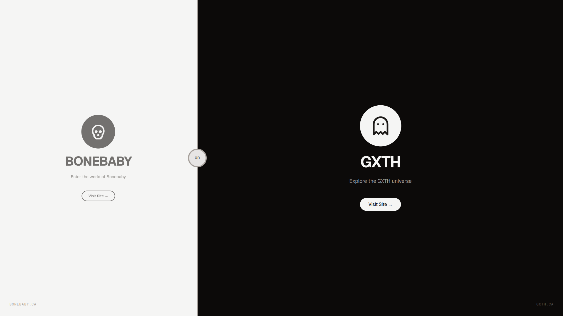
The site is intentionally one-page and binary. That keeps the story sharp and avoids client-side clutter.
It was exported from Next.js as a static site and served over nginx, which keeps the delivery simple and stable.
The page makes the domain itself part of the presentation, so visitors immediately see the live destination and understand it as a branded landing asset rather than an internal mockup.
This project was made to give the client a clean front door. The visual split, short copy, and direct outbound actions were chosen so the audience could understand both brand directions in seconds instead of navigating through a heavier marketing page.